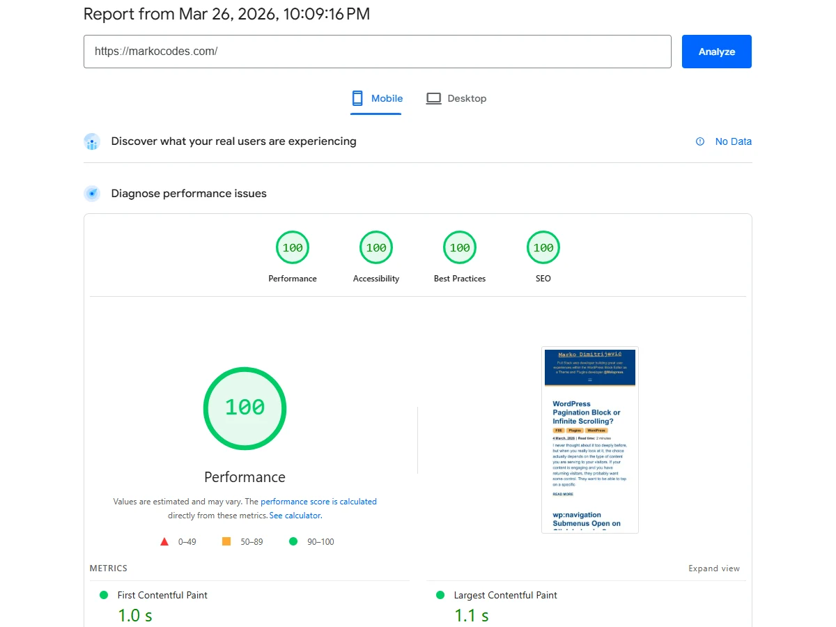
You might remember my previous post about restarting my blog and launching the WordPress FSE theme, Beyond FSE. I mentioned then that I’d likely continue to improve it whenever I found the time. Well, at that time, the mobile performance lab metrics were at 97, while accessibility and SEO were also just below 100. It was “good enough,” but not near perfect.
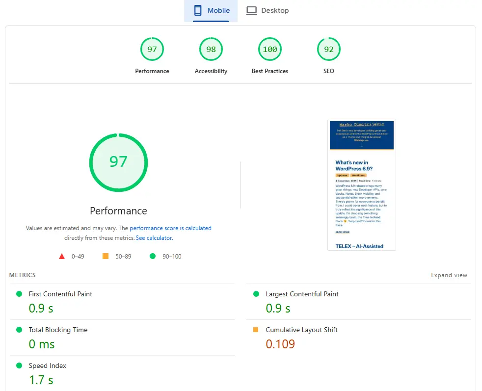
The performance issues were primarily caused by layout shifts and font loading. I recalled adding a preload tag for the font, but it didn’t seem to change anything, so I let it sit for a while. Today, I was determined to fix it. I suspected I had missed something, and I was right, it was a simple oversight.
First Fix: The Preload Tag
I was originally hooking this line into the wp_head action:
<link rel="preload" href="<?php echo esc_url( get_theme_file_uri( 'assets/fonts/inter/Inter-VariableFont_opsz,wght.ttf' ) ); ?>" as="font" type="font/ttf" crossorigin>
And this was the font style being added by WordPress:
<style class="wp-fonts-local">
@font-face{font-family:Inter;font-style:normal;font-weight:400 900;font-display:optional;src:url('https://markocodes.com/wp-content/themes/beyond-fse/assets/fonts/inter/Inter-VariableFont_opsz,wght.ttf') format('truetype');}
</style>
Everything looks fine, right? Not quite. The browser might have been ignoring the preload because the CSS specifies format('truetype') while the preload tag used type="font/ttf". Even with a .ttf extension, browsers often prefer the type="font/woff2" hint for variable fonts, or simply omitting the type attribute entirely to let the browser auto-detect from the header.
Additionally, I changed the wp_head hook priority from 5 to 1 to ensure it is among the first elements processed.
Second Fix: Font Display Strategy
The font-display: swap property is great at doing exactly what it’s told: showing a fallback font and then “swapping” to Inter once loaded. However, this was likely causing my 0.109 CLS (Cumulative Layout Shift).
I changed this to font-display: optional. This tells the browser to only show Inter if it is available almost instantly (which it should be, thanks to our preload). If it’s not ready, the browser sticks with the fallback for that session, resulting in zero layout shift.
Between these tweaks and some previous work moving styles from inline to external stylesheets, the performance score finally hit the ceiling.
Final Fix: Accessibility & SEO
This is actually what I tackled first after publishing the blog. It was a clear oversight on my part: I had simply forgotten to add the <main> tag to some of my templates!
The second issue was that “Links do not have descriptive text.” This related to the “Read More” buttons on the homepage. By default, they lacked specific descriptions. As you can see in the commit, I’ve now included the post title inside each button using the .screen-reader-text CSS class. This class is available in WordPress by default and it hides the text visually but keeps it within the button markup for screen readers.

Perfect or Near Perfect?
For most people, a 100/100 is a perfect score. However, these are still just Lab metrics. They provide great insight into what’s happening and are certainly a “big plus” in Google’s eyes, but real-world results vary. Depending on a visitor’s connection, device, or server load, the experience will fluctuate, especially since this is on shared hosting without active caching and even without CDN.
At the end of the day, it’s just a simple blog. But if you ask me, it’s “near perfect” just because even when something is perfect, that doesn’t mean it can’t be better, does it? 😀
Font size
Update:
The font I am currently using is “Inter.” I really like the typeface, but at a file size of 834kb (and still 450kb after converting to WOFF2), it is simply too heavy. I believe personal preferences shouldn’t compromise performance or any other part of the development process.
After testing several alternatives, I finally decided on “Public Sans,” which is only 42kb when compressed. I kept the preload in place, though it’s hardly necessary at this size. The visual appearance is almost identical so it is a total win-win. 😎