In this responsive web design tutorial we will create an simple but impressive responsive HTML5 website template from scratch. I tried to include many different features, so we will be dealing with a jQuery, CSS3 transitions and CSS Media Queries.
Please note that this tutorial is made for people who already have an intermediate knowledge level. Some parts of the tutorial will not be described in detail as it is assumed that you know how to e.g. include a script or a CSS file. If you have any questions you can always use the comment section or email me, and I will try to help you.
Creating the head with Doctype and Meta Tags
Let’s get started. Create website folder, name it whatewer you want, create index.html file. Next we will define HTML5 doctype and create our head section with all the required scripts and CSS files. The doctype declaration for HTML5 is easy compared to previous HTML/XHTML versions.
<!DOCTYPE HTML>
Let’s now declare HTML language, set the charset to UTF-8 and fill up meta tags:
<html lang="en">

<head>
<title>Go Up The Mountains - official page</title>
<meta charset="utf-8" />
<meta name="description" content="">
<meta name="keywords" content="">
<meta name="author" content="Marko Dimitrijevic">
<meta name="viewport" content="width=device-width, initial-scale=1.0" />
Pay attention on last meta tag “viewport”! To create a responsive design which should work on all kind of devices and screen resolutions we need to add the viewport meta tag which defines how the website should be displayed on a device. What this does is set the width of the viewport to the width of the device and set the initial zoom level to 1.0.
Creating the head – CSS and jQuery files
In our website we will use three different CSS files. If you look at the preview of our website you probably saw flag and checkbox and guess what these are not images. For achieving this effect we are going to use the iconic font – fontawesome and this is going to be our first CSS file, so go to fontawesome.io and download it, unzip it to the folder where you started to create this template and include it in the head of index.html file like this:
<link rel="stylesheet" href="font-awesome-4.1.0/css/font-awesome.min.css" media="screen">
As I mentioned before font awesome is iconic font very simple to use. While you are on their website check out some of the features, getting started section and of course see the icons.
The second stylesheet is called reset.css. What it does is resetting the styling of all HTML elements so that we can start to build our own styling from scratch without having to worry about cross-browser differences. For this tutorial I used Eric Meyer’s “Reset CSS” 2.0. You know the drill, download, extract it to your folder and include it in the head:
<link rel="stylesheet" href="css/mayer-reset-2.0.css" media="screen">
The third stylesheet is called style.css and contains all our styling. Create an empty style.css file in your website folder and include it in the head:
<link rel="stylesheet" href="style.css" media="screen">
Creating the head – Javascript / jQuery files
Now that we have included the CSS files let’s add all the required scripts.
You certainly noticed facebook slide box in our preview, and you probably saw this on numerous websites. Sliding effect is achieved with jQuery and very little code! jQuery slogan is “Write Less, Do More, JavaScript Library” so you get the point? Let’s download jQuery. In your website folder create another folder, name it “js” and extract jQuery files. In addition create another file in your “js” folder and name it “custom.js” – it will be used for facebook box slide animation later on. Here is the code for inserting these scripts:
<script src="js/jquery-1.11.1.min.js"></script>
<script src="js/custom.js"></script>
As we are using HTML5 and CSS3 features we should include several scripts to make these features visible in all browsers. To make this tutorial short, effective and to maintain attention of the readers we are going to mention them, but we are not going to include them.
- Modernizr – feature detection library for HTML5 and CSS3
- Respond – script which enables responsive design in IE
- PrefixFree – let’s us write the unprefixed CSS properties
Note: Although these scripts are not used in the tutorial, make sure to read about them because they can be very useful in some of yours later projects!
Your file should now look like this.
<!DOCTYPE html>

<html lang="en">

<head>
<title>Go Up The Mountains - official page</title>
<meta charset="utf-8" />
<meta name="description" content="">
<meta name="keywords" content="">
<meta name="author" content="Marko Dimitrijevic">
<meta name="viewport" content="width=device-width, initial-scale=1.0" />

<!--font awesome-->
<link rel="stylesheet" href="font-awesome-4.1.0/css/font-awesome.min.css" media="screen">

<!--css reset-->
<link rel="stylesheet" href="css/mayer-reset-2.0.css" media="screen">

<!--main stylesheet-->
<link rel="stylesheet" href="style.css" media="screen">

<!--jQuery-->
<script src="js/jquery-1.11.1.min.js"></script>
<script src="js/custom.js"></script>
</head>
Creating the body – Intro
Before we start coding let’s first have a look at the most important new elements in HTML5.
The primary purpose of main element is to map. This will help screen readers understand where the main content begins.
The new section element defines a part of a website with related content. It should not be used as a generic container element or for pure styling purposes. In that case rather use a simple div.
An article defines an independent piece of content which should be able to stand alone and still make sense.
A header defines a header for a document or a section.
A footer is used for defining the footer of a document or a section.
A nav defines a set of navigation links which should be the main navigation of your website.
An aside defines a section with secondary content. If an aside is placed within an article the content should be related to that specific article. If it is placed outside an article the content should be related to the site as whole.
Creating the body – Structuring website
The header is the first thing we need, it will include our logo, search, login or register links navigation and our intro image.
Inside the header we put first div element with a class “wrapper-background” which will contain search, logo and login/register links. For logo we are going to use fontawesome cloud-upload icon followed by the text Go UP and it will all be wrapped by another div element:
<div class="logo">
<h1><strong><i class="fa fa-cloud-upload"></i> Go UP</strong></h1>
</div>
Second div with a class “wrapper menu” will contain website’s main navigation. We are going to use two divs for left and right menu items. Beside that, another div with id “mobile” is present and it will be displayed when user view website on smaller screens which will be achieved with CSS media queries later on.
Third section of header element is div with class “wrapper slider”, inside of which is image placed under the new HTML5 figure element.
Your header code should now look like this:
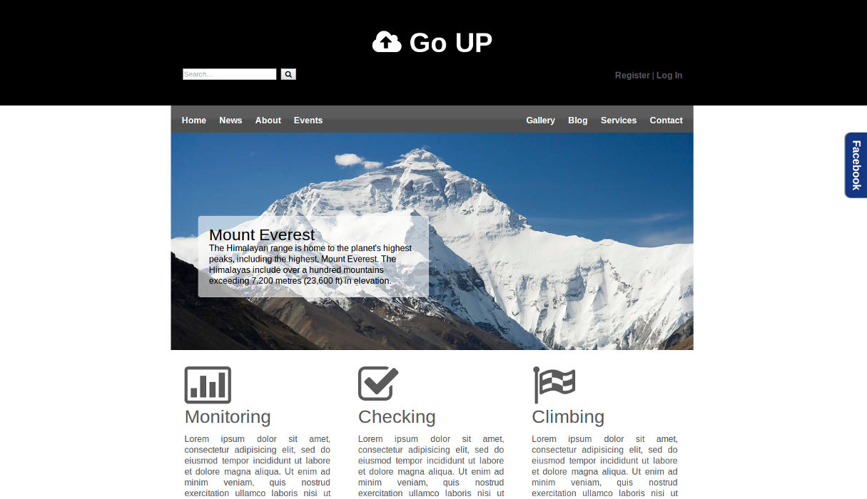
<body>
<header>
<div class="wrapper-background">
<div class="wrapper head">

<div class="logo">
<h1><strong><i class="fa fa-cloud-upload"></i> Go UP</strong></h1>
</div>

<div class="clear"></div>

<form id="searchform" name="searchform" action="noformaction.php" method="post">
<input name="search" type="text" placeholder="Search..." />
<button name="searchbtn" type="submit"><i class="fa fa-search"></i></button>
<p><a href="#">Register</a> | <a href="#">Log In</a></p>
</form>
</div>
</div>

<div class="wrapper menu">

<div id="mobile" class="mobile">
<h1><a><i class="fa fa-bars"></i></a></h1>
</div>

<nav class="left">
<ul id="left">
<li><a href="#">Home</a></li>
<li><a href="#">News</a></li>
<li><a href="#">About</a></li>
<li><a href="#">Events</a></li>
</ul>
</nav>

<nav class="right">
<ul id="right">
<li><a href="#">Gallery</a></li>
<li><a href="#">Blog</a></li>
<li><a href="#">Services</a></li>
<li><a href="#">Contact</a></li>
</ul>
</nav>

</div>

<div class="wrapper slider">
<figure>
<img src="images/himalayas-mount-everest.jpg" alt="Himalayas Mount Everest" />
<figcaption>
<h3>Mount Everest</h3>
<p>The Himalayan range is home to the planet's highest peaks, including the highest, Mount Everest. The Himalayas include over a hundred mountains exceeding 7,200 metres (23,600 ft) in elevation.</p>
</figcaption>
</figure>
</div>
</header>
Note: div’s with class “clear” are used to clear the floating.
Let’s continue with the main section which contains facebook slide box and three articles with a heading and an icon. Pay attention to tremendously small amount of code used for facebook slide box, everything else is done with CSS and jQuery. Your main section code should now look like this:
<main>
<div id="facebook">
<div class="pull">
<p>Facebook</p>
</div>
<div class="messages">
<p>Hello!</p>
</div>
</div>

<div class="wrapper content">
<article class="col3">
<i class="fa fa-bar-chart-o fa-5x"></i>
<h2>Monitoring</h2>
<p>Lorem ipsum dolor sit amet, consectetur adipisicing elit, sed do eiusmod tempor incididunt ut labore et dolore magna aliqua. Ut enim ad minim veniam, quis nostrud exercitation ullamco laboris nisi ut aliquip ex ea commodo consequat. Duis aute irure dolor in reprehenderit in voluptate velit esse cillum dolore eu fugiat nulla pariatur. Excepteur sint occaecat cupidatat non proident, sunt in culpa qui officia deserunt mollit anim id est laborum.</p>
<div>
<p class="posted">Thursday 07 August 2014.</p>
<button name="more" type="submit">Read ></button>
</div>
</article>

<article class="col3">
<i class="fa fa-check-square-o fa-5x"></i>
<h2>Checking</h2>
<p>Lorem ipsum dolor sit amet, consectetur adipisicing elit, sed do eiusmod tempor incididunt ut labore et dolore magna aliqua. Ut enim ad minim veniam, quis nostrud exercitation ullamco laboris nisi ut aliquip ex ea commodo consequat. Duis aute irure dolor in reprehenderit in voluptate velit esse cillum dolore eu fugiat nulla pariatur. Excepteur sint occaecat cupidatat non proident, sunt in culpa qui officia deserunt mollit anim id est laborum.</p>
<div>
<p class="posted">Thursday 07 August 2014.</p>
<button name="more" type="submit">Read ></button>
</div>
</article>

<article class="col3">
<i class="fa fa-flag-checkered fa-5x"></i>
<h2>Climbing</h2>
<p>Lorem ipsum dolor sit amet, consectetur adipisicing elit, sed do eiusmod tempor incididunt ut labore et dolore magna aliqua. Ut enim ad minim veniam, quis nostrud exercitation ullamco laboris nisi ut aliquip ex ea commodo consequat. Duis aute irure dolor in reprehenderit in voluptate velit esse cillum dolore eu fugiat nulla pariatur. Excepteur sint occaecat cupidatat non proident, sunt in culpa qui officia deserunt mollit anim id est laborum.</p>
<div>
<p class="posted">Thursday 07 August 2014.</p>
<button name="more" type="submit">Read ></button>
</div>
</article>
</div>
</main>

<div class="clear"></div>
We have reached the footer of our website. Into the footer we are going to put three columns like in main section, now with left and right navigation links, social icons and twitter widget. Below these three columns is a copyright section.
<footer> <div class="wrapper foot"> <div class="col3 nav-foot"> <nav class="left"> <ul> <li><a href="#">Home</a></li> <li><a href="#">News</a></li> <li><a href="#">About</a></li> <li><a href="#">Events</a></li> </ul> </nav> <nav class="right"> <ul> <li><a href="#">Gallery</a></li> <li><a href="#">Blog</a></li> <li><a href="#">Services</a></li> <li><a href="#">Contact</a></li> </ul> </nav> </div> <div class="col3 social"> <p> <a href="#"><i class="fa fa-google-plus-square fa-2x"></i></a> <a href="#"><i class="fa fa-pinterest-square fa-2x"></i></a> <a href="#"><i class="fa fa-youtube-square fa-2x"></i></a> <a href="#"><i class="fa fa-tumblr-square fa-2x"></i></a> <br /> <a href="#"><i class="fa fa-twitter-square fa-2x"></i></a> <a href="#"><i class="fa fa-reddit-square fa-2x"></i></a> <a href="#"><i class="fa fa-linkedin-square fa-2x"></i></a> <a href="#"><i class="fa fa-facebook-square fa-2x"></i></a> </p> </div> <div class="col3 tweet"> <div class="tweeted"> <p>Lorem ipsum dolor sit amet, consectetur adipisicing elit.</p> </div> <div class="triangle"> </div> <div> <p class="posted"><a href="#">@Loremipsum</a></p> <p class="date">07 August 2014.</p> </div> </div> <div class="clear"></div> <div class="col9"> <p><i class="fa fa-map-marker"></i> Lorem ipsum dolor 555/5, Serbia</p> <br /> <br /> <p class="copy">© Copyright 2014 Lorem ipsum</p> </div> </div> </footer> </body> </html>
Don’t forget to close the body tag and the html tag and we are ready with the basic markup of our webpage.
Note: using W3C Validation is good practice, i always validate my code and you should consider using it too.
This is the end of the first part of this tutorial. In the second part of the tutorial we are going to style our website to make it look like in the preview. I hope you liked the first part of the tutorial, please feel free to tell me how you liked it in the comment section.
To continue with the second part of this tutorial, click this link.
Leave a Reply