 In this second part of the tutorial we will be building the CSS styling and jQuery to make this HTML5 website responsive. Please be sure that you have worked through the first part of the tutorial where we have built the basic HTML markup and included all necessary scripts. We have already included Eric Meyer’s “Reset CSS” 2.0 in the first part of the tutorial. The Reset will take care of any differences in the default styling of HTML elements by simply resetting all the CSS values. That way we can start creating the styling from scratch.
Styling – Defining general CSS rules
When creating the stylesheet it is important to always use comments for the different sections of the CSS file. The first section is the general (global) section where we will put all stylings which are used on whole website. The first element that we want to style is the body element, so let’s define general font family, font size and font color. Next elements we are gonna style are: p, strong, em, a, and headings h1 to h6. In general styling we will include classes “wrapper“, “clear“, and also background color for header and footer, and here it is:
body {
font-family: Arial, Helvetica, sans-serif;
font-size: 16px;
color: #5B5B5B;
}

p {
line-height: 20px;
}

strong {
font-weight: bold;
}

em {
font-style: italic;
}

a {
color: #565656;
text-decoration: none;
font-weight: bold;
transition: color .5s ease;
}

a:hover {
color: #7D7D7D;
text-decoration: none;
}

h1 {
font-size: 38px;
}

h2 {
font-size: 34px;
}

h3 {
font-size: 30px;
}

h4 {
font-size: 26px;
}

h5 {
font-size: 22px;
}

h6 {
font-size: 18px;
}

.wrapper {
max-width: 960px;
margin: 0 auto;
}

.clear {
clear: both;
}

div.wrapper-background, footer {
background: #000000;
}
To make our website responsive we set the width property of the “wrapper” class to 100% and define a max-width of 960px. What this does is leaving elements with that class at 960px width when the browser window is wider then 960px. However when the browser width gets smaller than 960px the width of our sections will adapt to the browser’s width.
Styling – Defining the section rules
Now that we have finished creating the general CSS rules let’s start defining the rules for different sections of the website from top to bottom. For our main navigation we didn’t use the new HTML5 nav element, it is just simple div with class “menu“, but you can use nav instead if you like. Main thing about navigation is background which is product of new CSS3 property – gradient. What you should know if you are using gradient for background? It is to achieve cross browser compatibility! First we defined fixed background #5c5c5c which will be activated if a user with very, very old browser come to visit our site. Next thing to do is setting prefixed CSS properties for different browsers. See comments in CSS lines below, every comment is telling for which browser each property is used for.
.menu {
height: 50px;
margin: 0 auto;
background: #5c5c5c; /* Old browsers */
background: -moz-linear-gradient(top, #5c5c5c 0%, #5c5c5c 45%, #4f4f4f 55%, #4f4f4f 100%); /* FF3.6+ */
background: -webkit-gradient(linear, left top, left bottom, color-stop(0%,#5c5c5c), color-stop(45%,#5c5c5c), color-stop(55%,#4f4f4f), color-stop(100%,#4f4f4f)); /* Chrome,Safari4+ */
background: -webkit-linear-gradient(top, #5c5c5c 0%,#5c5c5c 45%,#4f4f4f 55%,#4f4f4f 100%); /* Chrome10+,Safari5.1+ */
background: -o-linear-gradient(top, #5c5c5c 0%,#5c5c5c 45%,#4f4f4f 55%,#4f4f4f 100%); /* Opera 11.10+ */
background: -ms-linear-gradient(top, #5c5c5c 0%,#5c5c5c 45%,#4f4f4f 55%,#4f4f4f 100%); /* IE10+ */
background: linear-gradient(to bottom, #5c5c5c 0%,#5c5c5c 45%,#4f4f4f 55%,#4f4f4f 100%); /* W3C */
}
Note: Did you remember the part 1 of this tutorial? Unprefixed CSS? Yesss, you can use prefixfree script and just write last line (with W3C comment behind it) and script will do the rest! Or you can google for CSS gradient generator and end up with something like colorzilla.
Mobile menu is story for itself, beside standard properties like margin, padding and float, we set display to none. Media queries will do the trick later on…
.menu div.mobile {
display: none;
float: left;
margin-left: 20px;
padding-top: 7px;
color: white;
}
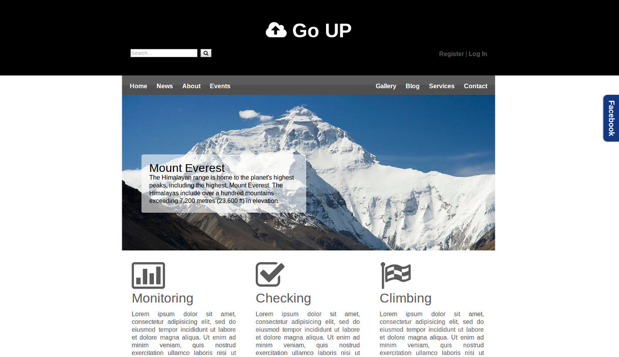
Next important styling is leading image for which we used figure and figcaption elements. Figcaption is useful in conjunction with the figure element to mark up images or diagrams. So here comes the CSS:
.slider figure {
height: 400px;
width: auto;
}

.slider figcaption {
position: relative;
bottom: 250px;
left: 50px;
width: 40%;
color: black;
background: #FFF;
background: rgba(255, 255, 255, 0.6);
padding: 20px;
border-radius: 5px;
}
Color property can be set as hex value, HSL, HSLA, rgb and rgba value where “a” in rgba stands for alpha opacity, alpha parameter is a number between 0.0 (fully transparent) and 1.0 (fully opaque).
In main section styling there is nothing special really. We set “col3” class and remove padding from last child element:
.col3 {
float: left;
width: 28%;
padding: 25px;
}

.col3:last-child {
padding-right: 0;
}
Actually you may pay attention to #facebook slide box styling because we are going to use that later with jQuery. Box is fixed so it position is remains the same same when you scroll the page and right position have negative value so the box remains hidden:
#facebook {
position: fixed;
right: -224px;
top: 250px;
}

#facebook div.pull {
background: #133783;
color: #FFF;
padding: 10px;
float: left;
width: 20px;
height: 100px;
text-align: center;
font-size: 20px;
font-weight: bold;
border-radius: 10px 0 0 10px;
box-shadow: -2px 0 2px #4F4F4F;
-ms-writing-mode: tb-rl; /* old syntax. IE */
-webkit-writing-mode: vertical-rl;
-moz-writing-mode: vertical-rl;
-ms-writing-mode: vertical-rl;
writing-mode: vertical-rl; /* new syntax */
}

#facebook div.messages {
background: #FFF;
width: 200px;
padding: 10px;
min-height: 380px;
height: auto;
border: 2px solid #133783;
display: inline-block;
}
In footer section you can find interesting styling of small triangle for twitter widget. It is made with CSS and you can find more about CSS shapes in my post The shapes of CSS:
div.triangle {
width: 0;
height: 0;
border-left: 8px solid transparent;
border-right: 8px solid transparent;
border-top: 16px solid #191919;
position: relative;
left: 30px;
}
Styling – responsiveness
We have finished styling our website and it should look just like in the website preview. The only difference is that the website we just created is not entirely responsive. We have already set our width and defined a max-width. However this will only change the width of our sections but the content inside these sections might be wrong positioned or overlapping. We will now use CSS Media Queries to specify rules for different browser window sizes:
@media (max-width: 768px) {

.logo h1 {
font-size: 40px;
}

.slider figure {
height: 320px;
}

.slider figure img {
width: 100%;
}

.slider figcaption {
width: 60%;
}

.col3 {
width: 90%;
}

footer div.col3 {
width: 25%;
}

.foot nav.left {
margin-left: 0;
}

div.social {
position:relative;
left: 0;
}

footer p.date {
float: left;
}
}

@media (max-width: 640px) {

.menu nav {
margin-top: 20px;
font-size: 14px;
}

.menu nav.right {
float: left;
margin-right: 20px;
position: relative;
left: 20px;
}

.slider figure {
height: 260px;
}

.slider figcaption {
width: 70%;
}

footer div.foot {
height: 400px;
}

footer div.col3 {
width: 40%;
}

footer p.date {
float: right;
}
}

@media (max-width: 480px) {

.menu div.mobile {
display: block;
}

.menu nav.left {
display: none;
}

.menu nav.right {
display: none;
}

.menu div.mobile ul {
display: none;
}

.menu div.mobile ul#left {
position: relative;
top: 30px;
}

.menu div.mobile ul#right {
position: relative;
top: -33px;
left: 70px;
}

.slider figure {
display: none;
}

.slider figcaption {
display: none;
}

footer div.foot {
height: 500px;
}

footer div.col3 {
width: 85%;
}

.foot nav.right {
float: none;
margin-left: 40px;
margin-right: 40px;
position: relative;
left: 40px;
}
}

@media (max-width: 320px) {

div.logo {
text-align: left;
margin-left: 20px;
}

form#searchform p {
float: none;
padding-top: 10px;
}

.col3 {
width: 80%;
}

footer div.col3 {
width: 83%;
}

.col9 p.copy {
text-align: left;
}
}
custom.js file – explanation
You will be surprised with how little code we are going to achieve great effects.
$(document).ready(function(){
/*toggle button menu for small devices*/
    $('#left').clone().appendTo('#mobile');
    $('#right').clone().appendTo('#mobile');
    $('#mobile h1 a').click(function(){
       $('#mobile ul').toggle(1000);
    });

/*facebook scroll*/
    $('.pull').mouseenter(function(){
        $('#facebook').animate({right:"0"});
    });
    $('#facebook').mouseleave(function(){
        $('#facebook').animate({right:"-224"});
    });

});
$(document).ready(function() is instructing jQuery that when all website elements (document) are loaded to initialize function. What follows is that we targeted specific elements with their classes or ids. We can target some elements with just using div in parentheses but in that way we are going to target all div elements in the document.
toggle button menu for small devices
Next we target div elements of our navigation with #left and #right ids then we use clone() method to copy all the content (menu items) and then we just use appendTo(‘#mobile’) to append menu items to mobile menu.
facebook scroll
Last thing to do is to animate facebook box. It is achieved with targeting element with class “pull” (blue facebook box) on mouseenter and using animate method which animates #facebook div, changing its predefined CSS property of right: -224px to 0px. Then we target whole #facebook div and on mouseleave facebook box is going to return to its default state (right:-224px). I said “whole” #facebook div because if you target “pull” again facebook box is going to return to its hidden position because mouse pointer will be out of the “pull” element.
Note: Now you know what jQuery “write less, do more” means, try to read jQuery documentation and google for some useful tutorials and you can do unimaginable things!
And that’s it. Well done! We have created a simple, well coded, responsive website with HTML5, CSS, CSS3 and jQuery.
Don’t forget to comment…
Leave a Reply